With Brentford having now launched next season’s home and away kits, thoughts have turned to other clubs and what they’ll be turning out in. From Newcastle United to Watford there are certainly what we could call some ‘eye catching’ designs out there. And there’s interesting news on the sponsors front where we also have further update from Hull City AFC, amongst others, who of course featured in yesterday’s column regarding their proposed name change. Not to mention a missed opportunity at Griffin Park…..
But first, kit. Brentford’s new shirts seem to have been universally well received.

This is ours – as seen on the official club site
Looking further afield, the same is not necessarily true and where I mentioned ‘eye catching before, perhaps eye gouging would have been a more appropriate term. Whilst not every club has shown it’s hand, enough have – revealing some true horrors – that we can already put together a top five of 2015/16’s worst home kits.
5: Dagenham & Redbridge. The Daggers have been traditionally red, sometimes with blue offset, and twice previously have gone for both colours in stripes. They’ve gone down this route for a third time but what a mish-mash. One red sleeve, one blue sleeve and then the alternate blue stripes are of ever decreasing width from left to right as you look at it. And they’ve got a new badge – with some daggers on it (the modern equivalent of our funky bee?)

The Daggers looking anything but sharp
4: Bradford City AFC. This is one team who haven’t been afraid to mix it up in the past. They’ve had some truly brilliant/bonkers takes on the claret and amber over the years. That said, this takes things to another level. You should wear a football shirt to, erm, play football in. Not to play chess, on.

Come for the football; stay for the draughts
3: Newcastle United: I feel sorry for Newcastle. Their black and white stripes are probably one of the most iconic designs in football. A style recognised the world over and, as such, to overly mix things up must be a tough job. They tried it last season with a broad black yoke and they’ve tried it again this year with the addition of blue (something that has very rarely featured). Everywhere.
From the morally dubious sponsor to the collar and cuffs, things begin to get a bit distracting. Then we have the black stripes themselves, which have had additional diagonal blue stripes added in to the lower half. Less mixing things up and more throwing things up.

White, black and blue – the traditional Newcastle colours
2: Cambridge United I’ve gone for this but it was a tough call. I could just has easily have picked Crawley Town. Both clubs (like the high viz Huddersfield United ‘away’ have adopted one of Puma’s half and half templates.
This is the shirt equivalent of one of ‘those scarves’.
Presumably the template was added to their catalogue to make up the numbers yet, incredibly, these three clubs have all picked it. The right hand side sees the traditional club colour. The left sees that colour interwoven with black diagonal stripes of varying width between them.
Crawley have already announced they are sticking with this for two seasons – their model looks suitably embarrassed at this though.

As if relegation hadn’t been bad enough
However, Cambridge scoop the prize – simply, because they’ve used a hashtag to justify it. Regular readers will know of my disgust for such things, and whilst it isn’t #novemberkings, we aren’t too far off in the crap marketing stakes.

Terrible kit – and a hashtag
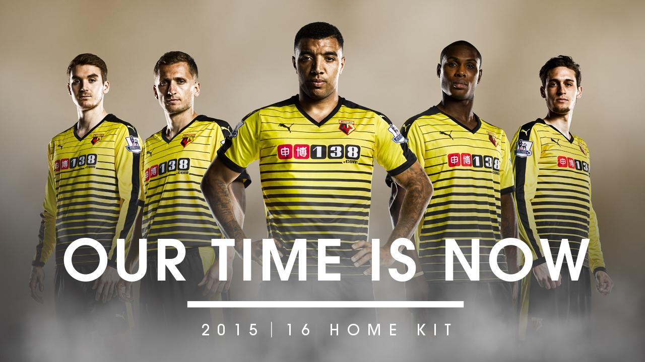
1: Watford. I had nothing but congratulations for Watford and their supporters when they got promoted from the Championship last season. I have nothing but commiserations for Watford and their supporters about what the team will be wearing in the top flight.
Subtlety and tradition have gone out of the window. Instead of the yellow with black and, sometimes, red trim they’ve opted for hoops. Lots of hoops. Whilst these may be in black and yellow, there are so many that, and of such differing thickness, as to make Dagenham’s shirt suddenly seem discreet. And, like Cambridge before them, there’s a slogan (thankfully no hashtag, yet).
To make it worse though, Watford’s appears to be a bespoke effort. Somebody has actually chosen and designed this. Maybe it is meant as a ‘hornet’ style but, as a traditionalist, if you want comedy then that’s what the change kit is for. At least the U’s could hide behind a template.
Presumably the tickets at Vicarage Road will come with a warning that the strobe effect from watching Watford running around could cause seizure.

When bad marketing meets bad design, you get this
As a side note, I also promised some updates on the sponsorship front. Hull City AFC has recently announced a tie in with Flamingo Land. I’m really hoping they follow their stunning ‘tiger stripe’ efforts of the early 90s with a similar pun related, flamingo style away kit when that gets launched. And congratulations, by the way, as their proposed name change to Hull Tigers was, again, kicked into touch yesterday – this time at a meeting of the Football Association Council.
Hull City owner Doctor Assem Allam had always promised to throw his toys out of the pram (not literally, although who knows what he gets up it in his spare time) and walk away if he didn’t get his way. So will he be true to his word or will the lure of being a club owner remain too much and he’ll just hope everybody now forgets about his threat.
In a very brief statement on the official club site he told supporters, “We always knew that following a change to the FA’s policy, the chances of changing the name were slim but we also feel it is important to fight for what you believe in and we believe that being called Hull Tigers would be the best strategy for the future.
We will be taking some time away from the Club to consider our options and we will make no further comment until we have come to a conclusion.”
Given his option had been categorically stated previously – give me what I want or I’m going – my money is on him sitting tight, possibly under the guise of ‘not being able to find a buyer’, and then hoping all this blows over. But hey, what do I know – I’m just the numpty on the terrace.

Could Flamingos borrow from Tigers – with or without Dr Allam ?
Getting back to shirt sponsorship, sad news reaches me that the iconic association between Rainham Steel and Scunthorpe United has finally come to an end. As comedian Dave Gorman once said (or words to eh effect of): you can tell a true football fan by saying two words: Rainham Steel. Then watch for the reaction – it’ll either be glazed confusion or the utterance of the name Scunthorpe United.
Whilst I can’t knock them for giving over their shirt to a charitable cause – the battle against Prostate Cancer – it still marks the end of an era as recognisable as Brentford and KLM or Arsenal and JVC.
And finally, just as Brentford have changed their sponsor to Matchbook.com, Bury have changed theirs too. Given everything that happened at Griffin Park last campaign, how wonderful if Matthew Benham had, somehow, been able to negotiate a deal with the Shakers’ new partner.
Just think of the reaction if we’d had this across the red and white stripes.

Football truly is a village
Nick Bruzon
Tags: Adidas, AFC, Amazon, Assem Allam, BBC, Bees, Beesotted, Beesplayer, blog, book, Bradford, Brentford, Brentford FC, Bruzon, Bury, Cambridge, Celebrating like they'd won the FA Cup, Championship, change, City, Crawley, Dagenham and Redbridge, Daggers, Dave Gorman, e-book, FA Cup, hornets, Hull, Hull City, Matthew Benham, name change, Newcastle, Newcastle United, Puma, Rainham Steel, Scunthorpe United, Shirt, sponsor, Tigers, United, Village, Watford


Forget KLM, Top Man, JVC. Dave Gorman gets to the point
23 SepIt’s all a bit quiet on the Brentford front this week and, frankly, after the mauling at Middlesbrough that suits me just fine. A chance for everyone to take stock and put the wheels back on ahead of Leeds United visiting Griffin Park on Saturday.
There’s no JPT action tonight (fortunately) and so if that’s your bag then I’m sure there’ll be commentary on Newport v Swindon somewhere. Likewise, (not so fortunately after we gifted Fulham their only positive result of an otherwise hilarious season) there’s no Capital One Cup.
That said for those still watching in that one, the highlights would seem to be Will Grigg getting the chance to test his shooting boots against Bradford – a tougher task than previous opponents Manchester United – and Middlesbrough hoping to prove that Saturday was no fluke with a visit to Liverpool.
So I hadn’t really planned on writing anything today, keeping the powder dry for Leeds at the weekend. Then I saw a tweet published by Billy Reeves. Specifically in regards to comedian Dave Gorman.
I’m very much a fan of the lumberjack shirt sporting, powerpoint wielding comedian whose new book ‘Too much information’ is out now. And I guess, theoretically, that makes him (unsubtle plug time) a label mate of yours truly on Amazon.
However, the proper point being that Billy shared an extract of this new work yesterday that really, to me summarised, exactly what it means to be a football supporter.
You can have your variations on stripes and sashes, but there are certain things that make a kit iconic. Those details that, every once in a while, transcend even the team colours themselves to be universally associated with a team
Move over KLM, Top Man, JVC and Ramsay Ladders. This, for me, nails it.
And Mr. Gorman says it so much better than I could ever try to.
The test of a real football fan (or just a kit nerd)
Possibly the only thing in common with Dave Gorman
Tags: 2013/14, Alan Judge, Alex Pritchard, Amazon, BBC, Bees, Beesotted, Betinho, Billy Reeves, blog, book, Brentford, Brentford FC, Capital One cup, celebrated, Celebrating like they'd won the FA Cup, Championship, comedian, comments, Dave Gorman, david button, diary, FA Cup, football, Forfar Athletic, Fulham, Griffin Park, Harlee Dean, iconic, James Tarkowski, Jon Toral, Jonathan Douglas, José Ignacio Peleteiro Ramallo, Jota, JPT, just don’t mention that penalty, JVC, kindle, kit, KLM, Leeds, Leeds United, Liverpool, Manchester United, Marcello Trotta, Marcos Tébar Ramiro, Mark Warburton, Matthew Benham, Middlesbrough, MK Dons, Moses Odubajo, Natalie Sawyer, Newport, Nick Bruzon, Nick Proschwitz, penalty, powerpoint, Rainham Steel, Ramsay Ladders, Russell Slade, Sam Saunders, sash, Scunthorpe, Scunthorpe United, Shirt, Sky bet Championship, sponsor, stripes, Stuart Dallas, Swindon Town, Too much information, Top Man, Toumani, Trotta, United, Warbs, Will Grigg